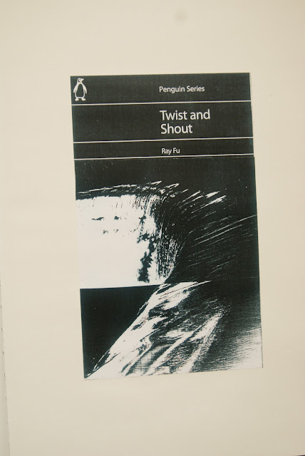
So for this project we were asked to create some penguin book covers based on the titles that we were given objects of desire,an ideal home,twist and shout and the divided self four really intersting titles and we had to follow the traditional penguin book cover layout. So for this new breif as my previous projects was very mixed media, i wanted to approach it differently i wanted to incoperate photography. so instead of searching for the images like the previous projects i could have a lot more control of the images so i did a black and white shoot.
The idea behind the shoot i didnt want to really aproach it by literly taking certain pictures for certain titles i wanted to keep my pictures quite open and not really have strong themes, so that when i came to play around with them i wasnt really constricted.
but i did have a certain concept to my photographs and that was to really play around with angles and shapes, so i shot a lot of my photographs shooting up looking at things like telegraph wires and very skeletal trees. The idea was to use angles much in the way as jan tschichold, by using angles to draw your eye in certain directions.
jan tschichold was also a very big name for penguin books as he designed the original penguin book layout


tshicold very cleverly used angles and lines to direct you eye to certain parts of the page and i really wanted to play with that idea with my own covers.
so after shooting the shoot i started to photocopy my photographs, and the then cuting them up and i really started to play with the angles and composition i also played around with negative copies wich worked really well. I also started to play around with colour copies of the photographs wich started to come out with some really great outcomes i also played around with idea of puting colured sections on to black and white wich gave a really good contrast.
these are my outcomes i am really pleased with them they have really nice grainy qualitys to them wich gives the covers more of a raw feel, and for the images fitting in with the covers titles i think have worked well because they arent really obvious so it makes the viewer look closer and think a little bit more. Although i do like the outcomes i think it would be intresting to see what they may off looked like if i had scanned the photographs instead of photocoping them, they might of looked less grainy and a bit more crisp but to be honest i think the grainy quality lends it self to the titles and the whole raw style. I also like how there's a certain style running through the covers so you can tell there part of a collection.


No comments:
Post a Comment