Sunday, 11 March 2012

Forever I've known nothings forever

For the last 2 weeks we have been asked to chose a peice of text that we found interesting, and to create a peice of imagery to go with the text and I decided to use a Maccabees lyric "forever I've known nothings forever" from the song "forever I've known" which I thought was a nice little play on words. It also was a very open peice of text so I wouldn't really be constricting myself. So the basic idea for the imagery was there was a band of skulls album cover i really liked which was created by their bass player the album was "Baby doll face honey"  its this beautiful paint and ink piece that had been mirrored and when you looked closer you could depict these interesting shapes and imagery much like the Rorschach test http://en.wikipedia.org/wiki/Rorschach_test . I wanted to create somthing on these lines so I started to experiment with paints by creating interesting shapes on a piece of paper and then literally folding the paper in half so that it creates these crazy quite intricate shapes and patterns. very similar to something you would in early primary school when you had to create butterflies, but obviously i wanted it to be a lot more sophisticated than that.


so after scanning them in to the computer I really went to work on them in Photoshop. Firstly I mirrored them and then I started to play around with layering them, and for the type I wanted to keep it really quite basic as the imagery was really quite busy and psychedelic looking so I didn't want to over complicate things. some of the type has been inspired by my previous project for the album covers and here are my results


the results have come out better than expected there are some really intricate and interesting textures that are not apparent at first glance but once you  really look up close you really notice them im really pleased with the results.

Cul-de-sac

This week we have been asked to create a movie poster for the Roman Polanski film Cul-de-sac http://www.imdb.com/title/tt0060268/  and no imagery from the film is to be be used on the poster.

Cul-de-sac although a film i wouldn't necessarily pick was an interesting film and although as a story line i dint really like it i could appreciate it for its artistic quality's and certain camera angles were really nice and a thing i really liked was how there was always little subtle hints throughout the film.

In some country's still to this day when a movie is released in the country the movie artwork isn't always necessarily at hand so its up to designers and illustrators to create the artwork so they have to try and get the the general gist of the film in the poster, a good example for doing this is Poland  http://www.polishposter.com/

so we had to basically do the same thing the original poster for Cul-de-sac was created by a very famous designer Jan Lenica who was often the designer commissioned for most of Roman Polanski films

this is the original Cul-de-sac poster that was actually used which has really nice well thought out shapes and really nice painterly quality's and in contrast really crisp, sharp text which was usual for Jan Lenikas work http://www.poster.com.pl/lenica.htm


so for my poster i started to think about the word Cul-de-sac and what it meant i started to think about words like dead end and confined,  i then found this really nice image of two cliffs with the sea in between them which was perfect because not only did it look very similar to the set in the movie. i also had this idea to try and confine the the text in between the two cliffs to to give the feel of  a cul-de-sac. I feel that the sepia effect one is my more stronger poster as it has a better feel of the film as the film was in black and white. if i had used the colour one it wouldn't really give the feel of the movie, im really happy with the layout of the poster for the text i tried to blend the words together to made them appear trapped together which i think has worked really well and i think my poster does give a general feel and atmosphere of the film.

Saturday, 11 February 2012

Album covers

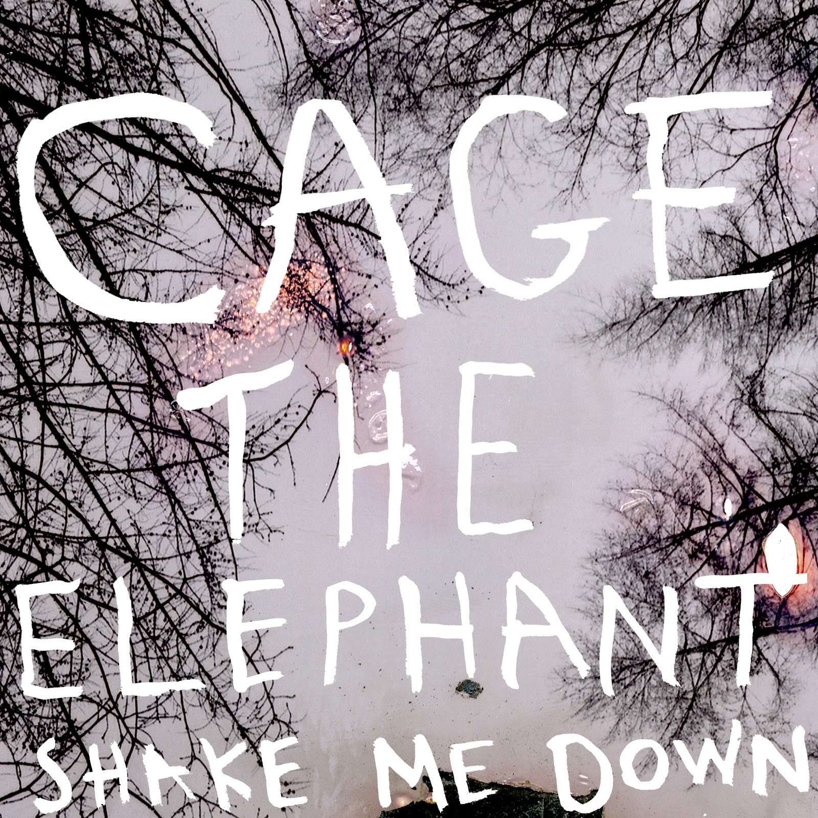
Album covers we have been asked to choose from a list of bands and titles and to create album covers for the chosen band and song title. I chose "Cage the elephant" "shake me down"  after watching the bands video i got a general feel for the song and what its about, the video is quite sad it follows a man through his memorys before he dies and, the video uses a lot of Autumn colours  lots of rich burnt out colours.

I wanted to approach this brief photographically as i thought photographs would best fit the song as photographs are seen as memories, i then wanted to use bleach and burn out certain sections  when you bleach out photographs they go this fantastic orange and brown colour which are quite autumnal colours and the bleached out section would represent the memories fading

for the text i wanted to try doing some hand rendered  as i thought that would lend it self to the style of the photographs i wanted to create some really quite scratchy quite free text much like vaughan oliver


i wanted to create a scratchy effect so i used a blunt stick and did some text in stick and ink i then scanned them in and i inverted them into white as i thought the photographs were pretty busy so i didn't want to over complicate things, when i did try with the text in black it didn't really stand out it just blended in with the trees


I really like the outcomes the text has come out brilliantly and has a great contrast against the burnt photographs  and i think most importantly it has general feel of the song.
 another thing i thought would be a great idea was to use the pin hole photographs as i thought the double exposures looked great and i think would really lend them self to the brief


i started to play around with digital text in Photoshop and started to play around with lines and composition although they do look great i didn't really think they portrayed the song very well and i really just preferred the previous covers, the other cover are a lot more stronger and a have a bigger impact and really stand out.

Pinhole

We did a workshop on pinhole photography and basically these are my results, I also started to get adventuress and did some double exposures which if I don't say so myself have came out rather nice. And for you who are unaware what pinhole photography is.http://en.wikipedia.org/wiki/Pinhole_camera


Phograms

we did a workshop on photo grams and these are my results and for you who don't understand what a photo gram entails http://en.wikipedia.org/wiki/Photogram also I suggest you check out Man ray the man most famous for creating photo-grams.

Own penguin book covers

Own penguin book covers basically we have been asked to create are own titled penguin book cover so you could either choose and existing author or create your own title. And I chose to do my own titles, so for this brief again i wanted to do something completely different i wanted to approach it illustratively.

in lessons i did some little doodles on my board and one of the tutors commented on how he liked the style off them, and i thought this brief was a perfect opportunity to introduce some illustrations but i wanted to make them a bit more sophisticated than the ones on my board, i then remembered a children's book illustrator Maurice Sendak the artist famous for the were the wild things are.

i really liked how he created tonal quality's with using different line quality's and creating real great textures with line thicknesses, and how even though using quite flat colours he still gave the characters a lot of depth so i wanted to try and use this techniques in my own covers

the ideas behind the characters and covers is that i wanted to create quite humorous characters the characters are completely out of my imagination, and then the titles were then thought off after i had drawn the characters


these are my outcomes in the style of Sendak i wanted to use line quality's to create texture but i thought it would be a nice contrast to keep the characters really quite basic and have a lot of detail in there hair, and i wanted to use shapes to create really nice textures much in style of David Gentlemen 
my final outcomes have come out fantastically its been a great experience to approach a brief differently, and i think the use of line quality and the contrast between them and the washed out colours looks great. I do think it would off been interesting to off seen what it would of looked like if it was coloured in on Photoshop using very flat block colours it might off looked a lot more cleaner and probably a lot more crisper, and maybe even more sophisticated looking as my outcome have quite a childish element to them but i do think the childish element works well for the actual characters.

Penguin book cover


So for this project we were asked to create some penguin book covers based on the titles that we were given objects of desire,an ideal home,twist and shout and the divided self four really intersting titles and we had to follow the traditional penguin book cover layout. So for this new breif as my previous projects was very mixed media, i wanted to approach it differently i wanted to incoperate photography. so instead of searching for the images like the previous projects i could have a lot more control of the images so i did a black and white shoot.

The idea behind the shoot i didnt want to really aproach it by literly taking certain pictures for certain titles i wanted to keep my pictures quite open and not really have strong themes, so that when i came to play around with them i wasnt really constricted.

but i did have a certain concept to my photographs and that was to really play around with angles and shapes, so i shot a lot of my photographs shooting up looking at things like telegraph wires and very skeletal trees. The idea was to use angles much in the way as jan tschichold, by using angles to draw your eye in certain directions.

 jan tschichold was also a very big name for penguin books as he designed the original penguin book layout
    although his name was big for the penguin books he was also very famous for creating posters that had very strong angular compesition and these are the actual posters that inspired my shoot


tshicold very cleverly used angles and lines to direct you eye to certain parts of the page and i really wanted to play with that idea with my own covers.

so after shooting the shoot i started to photocopy my photographs, and the then cuting them up and i really started to play with the angles and composition i also played around with negative copies wich worked really well. I also started to play around with colour copies of the photographs wich started to come out with some really great outcomes i also played around with idea of puting colured sections on to black and white wich gave a really good contrast.


these are my outcomes i am really pleased with them they have really nice grainy qualitys to them wich gives the covers more of a raw feel, and for the images fitting in with the covers titles i think have worked well because they arent really obvious so it makes the viewer look closer and think a little bit more. Although i do like the outcomes i think it would be intresting to see what they may off looked like if i had scanned the photographs instead of photocoping them, they might of looked less grainy and a bit more crisp but to be honest i think the grainy quality lends it self to the titles and the whole raw style. I also like how there's a certain style running through the covers so you can tell there part of a collection.